
.png)

Researched and redesigned the vendor experience for an event services and ticketing app, improving user flows, boosting usability by 12%, and enhancing usability testing.
Immer's Mission
Immer aims to create an equitable ecosystem in the live event industry by offering an innovative platform that empowers organizers and entertainers to create, manage, and monetize events independently.
My Role
Led end-to-end UX/UI design, using navigation data to refine tasks, optimize sprints, and enhance user experience.
Timeline
5 months, 3 phases to launch seamlessly while continuously reiterating based on user feedback.
Team
10+ Designers, 4 Product Managers, 5+ Developers
Tools & Methods
Conducted Usability Testing, Crazy 8's ideation, Competitive Analysis, and Heuristic Evaluation to refine User Flows. Analyzed data, identified pain points, and proposed impactful solutions through iterative design, presenting insights to stakeholders for continuous improvement.
Before diving into the product, let's understand the problems, gaps and the solution
Problem
Vendors on Immer’s platform faced challenges in staying informed about real-time event updates, order changes, and special requirements, leading to miscommunication and inefficiencies.
Gap
No centralized system for receiving real-time notifications, making it difficult to manage order changes, special requirements, and event updates effectively. To bridge this gap, a dedicated Notifications & Alerts screen had to be designed.
Solution provides real-time updates through live chat participation and adding Polls, enhances vendor-organizer-attendee interaction, and improves efficiency with clear, organized alerts ensuring a seamless and user-friendly experience.
Solution
My journey to the task solution


Understanding and Research


Ideating findings


Re-navigating user flows


Designing and adding new features


Solution and key takeways
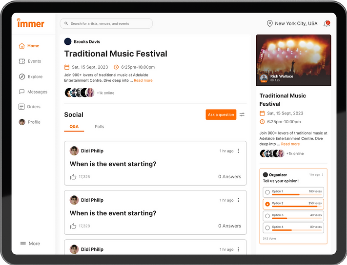
🔊 Live Q&A Participation Audio Feed and Notifications Alert
Research Tasks
Add real-time vendor notifications.
There was a lack of user engagement during live streaming or event sessions, as hosts couldn't provide vendors with real-time notifications and alerts from attendees. To enhance engagement, new features were needed to bridge this gap.
💡 Design thinking
CSD Matrix
I used this framework for outlining and visualizing what everyone involved in a project knows (Certainties), hypothesizes (Suppositions), and doesn't know yet (Doubts)


%201.png)
🛠️ Filling the Gaps

Compititive Analysis
Twitter X Spaces is a feature within the main platform, offering live audio conversations.
Users are notified in advance when joining, as they follow the X accounts hosting the Space.

➡️ Re-creating the current user flow to optimize it by reducing the number of steps for a better user experience
By streamlining the user journey, I simplified task completion by reducing steps, making the process faster and more intuitive. This improvement boosted efficiency and user satisfaction by saving time and minimizing clicks.

Understanding the Problem

Talking about the User Side of the Flow
Felt hesitant to ask questions during live sessions may disengage, limiting participation.
Struggled to track live sessions, identify hosts and co-hosts, and receive real-time updates, resulting in a fragmented experience.
Talking about the Organizer Side of the Flow
Lack of clarity in identifying co-hosts, and organizers struggled to engage during audio chats, making it difficult to reference past conversations and understand the users.

Analyzing the pain point Gap and getting through the Opportunities
Gap Analysis:
Users need easy access to chat transcripts for better engagement, while organizers require chat records to analyze feedback and improve future sessions.
Improvement in User Engagement
Providing access to chat transcripts, Q&A, and polls enhances engagement, improves information retention, and boosts user satisfaction.
Better Data for Organizers
Transcripts provide organizers insights into user interactions, helping analyze feedback and improve future events.
Superlative Final Design Solutions
Attendee Side of Updated design
To address user issues, I designed and implemented a polls feature that encourages involvement, fostering a more inclusive and engaging experience, and a dashboard that displays active sessions, enables co-host view in a different element, and integrates notifications for a seamless, unified experience.


Sneek Peak of the Moblie view


Organizer Side of Updated design
Introduce an automatic transcript feature for live chats, allowing organizers to easily reference past conversations, track key discussions, and efficiently follow up on important points, ultimately enhancing the user experience and improving session management.
Final Results: Pre-Launch
Providing access to Polls resulted in a 23% increase in user engagement
Led to 22% increase in Live chat participation and a more inclusive environment, improving overall user satisfaction
User engagement increased by 18%, as participants could easily reference past conversations, leading to a more seamless experience.
Improved organizer efficiency by 2 times, reducing follow-up time and enhancing discussion tracking.
Key takeaways and Learnings
Hierarchy Enhances Clarity
Established a clear visual and functional hierarchy that helped users quickly avigate, reducing cognitive load and improving efficiency.
Information Architecture Matters
Structured data logically eliminated friction and ensured users could navigate seamlessly without confusion.
Decision Simplicity
Reduced the number of actions required for key tasks improved usability, helped me ensuring users weren’t overwhelmed with too many choices
Design as a Communication Tool
Design became a powerful way to communicate ideas, with visuals helping to clarify complex requirements and bridge gaps between technical and non-technical teams.
Take a moment to check out the amazing designs below, showcasing the solutions we crafted to address key challenges and gap

Business Considerations an Management
🎯 Business-Driven Design: Aligned UX decisions with business goals to streamline communication, reduce response times, and boost vendor efficiency.
🤝 Stakeholder Collaboration: Worked cross-functionally to ensure the feature met both user needs and market demands, strengthening Immer’s competitive edge.
📈 Impact-Driven Approach: Prioritized usability, clarity, and efficiency, improving vendor coordination and reinforcing user trust.
What my day to day role looks like?
At Immer, I had the thrill of designing mobile and web applications that didn’t just connect artists with their audiences—they redefined how events and entertainment could thrive in the digital space. Competing with platforms like TwitterX, we aimed to create something more personal, seamless, and impactful for creators and their communities.
What I actually did :
-
Lived in Miro and Figma: I created over 100 wireframes and prototypes, constantly testing and iterating to make sure the designs weren’t just functional but also delightful. Balancing user needs, stakeholder visions, and market competition kept me on my toes—and I loved every second of it.
-
Battled usability quirks: By diving into surveys, competitive analysis (hello, TwitterX!), and user research, I pinpointed pain points and worked with the team to make fixes that felt intuitive and user-first.
-
Revamped user journeys: Using the double diamond method, I streamlined user flows, slashing extra clicks and creating an experience smoother than scrolling through a perfectly curated feed.
-
Brought the MVP to life: Collaborating with stakeholders and designers, I helped shape a product that wasn’t just functional but left a lasting impression. Think: easy to use, engaging, and exactly what users didn’t know they needed.
What made it fun? Competing with industry giants like TwitterX and knowing we were creating something unique.
What made it funny?
Realizing that sometimes, the best ideas come from “What if we tried this ridiculous thing?” moments—and they actually work.
